Based on our recent study “Widening Wealth Inequality”, we found that although there are gains in housing wealth in recent years from rising home prices, fewer people benefit because of the decline in the homeownership rate. Hence, wealth inequality increases in the United States.
But how did housing wealth change at a local level between 2011 and 2013? Based on the American Community Survey (5-year estimates of median home value), the visualization below presents estimated housing wealth gains/losses by zip code, metro area and state. The change in wealth includes the change in median home values (2011 – 2013) and an estimate of principal accumulated.
Much has changed since 2013. Nationally, housing prices have risen by about 15 percent since then and much of the increase in home prices has been seen in zip codes that showed large losses as of 2013, as seen below. Still, this study is useful in showing the geographic distribution of gains, which were generally widespread even after the housing bust, and losses, which like the largest gains were mostly concentrated. Note, two zip codes form the San Jose metro market made it to the top-10. At the same time, one zip code from San Jose was in the bottom-10. Even within a metro market, there appears to be a sizable variation on which zip codes thrive or not.
From a sample of 12,763 zip codes, here is a summary of the zip codes with:
a) Higher gains in housing wealth (2011-2013): (click on image to zoom)
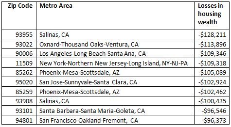
b) Higher losses in housing wealth (2011-2013): (click on image to zoom)
Check below to see whether your zip code experienced gains or losses in housing wealth for the period 2011-2013:
Click here to view source article with interactive map.
By: Nadia Evangelou (Economists’ Outlook)
Click here to view source article.
Commercial Association of REALTORS® - CARNM New Mexico
How Did Housing Wealth Change at Your Zip Code?
06.17.2015

© 2024, Content: © 2021 Commercial Association of REALTORS® New Mexico. All rights reserved. Website by CARRISTO